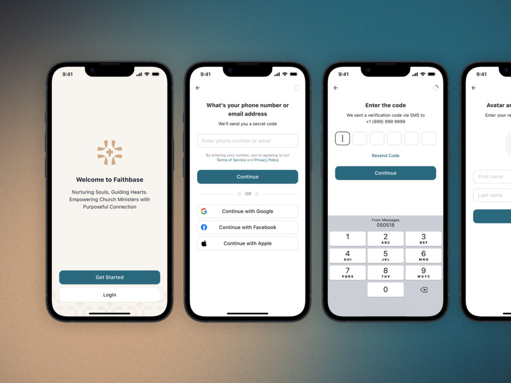
Hey there, fellow designers! Today, I want to talk about something that’s been on my mind lately: why some designs just click with users while others fall flat.
You know that feeling when you use an app or website, and everything just feels right?
It’s not magic — it’s science!
Let’s dive into some key principles that can transform your designs from good to great.
1. Fitts’s Law
Size and distance matter
Ever noticed how much easier it is to tap that big, juicy “Buy Now” button on your phone? That’s Fitts’s Law in action.
Simply put, the bigger and closer an element is, the easier it is to interact with.
Think about it: a large button near your thumb is way easier to hit than a tiny one tucked away in a corner.
When designing, consider the size and placement of your interactive elements. Your users’ fingers (and patience) will thank you!
2. Hick’s Law:
Keep it simple, smarty
We’ve all been there — staring at a menu with a gazillion options, unable to decide what to order. That’s Hick’s Law messing with our heads.
The more choices we have, the longer it takes to make a decision.
In design, this means simplifying your interfaces. Don’t overwhelm users with too many options.
Break complex tasks into smaller steps. Remember, sometimes less really is more!
3. Jakob’s Law:
Familiarity breeds content(ment)
You know how you can walk into a dark room and instinctively reach for where you expect the light switch to be? That’s Jakob’s Law at work.
Users expect your site or app to work similarly to others they’re familiar with.
Good design is actually a lot harder to notice than poor design, in part because good designs fit our needs so well that the design is invisible.
Don Norman
Don’t reinvent the wheel unless you absolutely have to. Stick to common design patterns and conventions. It’ll make your users feel right at home.
4. Miller’s Law:
The magic number seven
Ever wonder why phone numbers are typically split into chunks? It’s because of Miller’s Law, which states that most people can only hold about 7 items in their short-term memory.
When designing, break information into digestible chunks. Use categories, tabs, or accordion menus to organize content.
Your users’ brains will appreciate the breather!
5. Law of Proximity:
Cozy up those elements
Items that are close together are perceived as related. It’s why things on the same shelf in a store often seem similar.
Use this to your advantage in your designs. Group related items together visually to create a sense of organization and hierarchy.
6. Law of Similarity:
Matchy-matchy magic
We tend to see items that look alike as related. A red button among blue ones will instantly stand out as different.
Use this principle to create visual harmony in your designs, or to draw attention to important elements.
7. Von Restorff Effect:
Stand out from the crowd
Remember that person in the wild costume at the last party you went to? Of course you do! That’s the Von Restorff Effect — unique items are more memorable.
In design, use this to highlight key information or calls-to-action.
Just don’t go overboard—too many “unique” elements, and nothing stands out!
Wrapping Up
These principles aren’t just abstract theories — they’re practical tools you can use every day to create more intuitive, user-friendly designs.
Remember, great UX isn’t about following rules blindly. It’s about understanding how people think and interact with digital spaces, and designing with empathy and intention.
So next time you’re scratching your head over a design problem, take a step back and consider these principles. They might just help you crack the code!
What’s your go-to UX principle? Drop a comment below—I’d love to hear your thoughts!
Stay curious and keep designing,